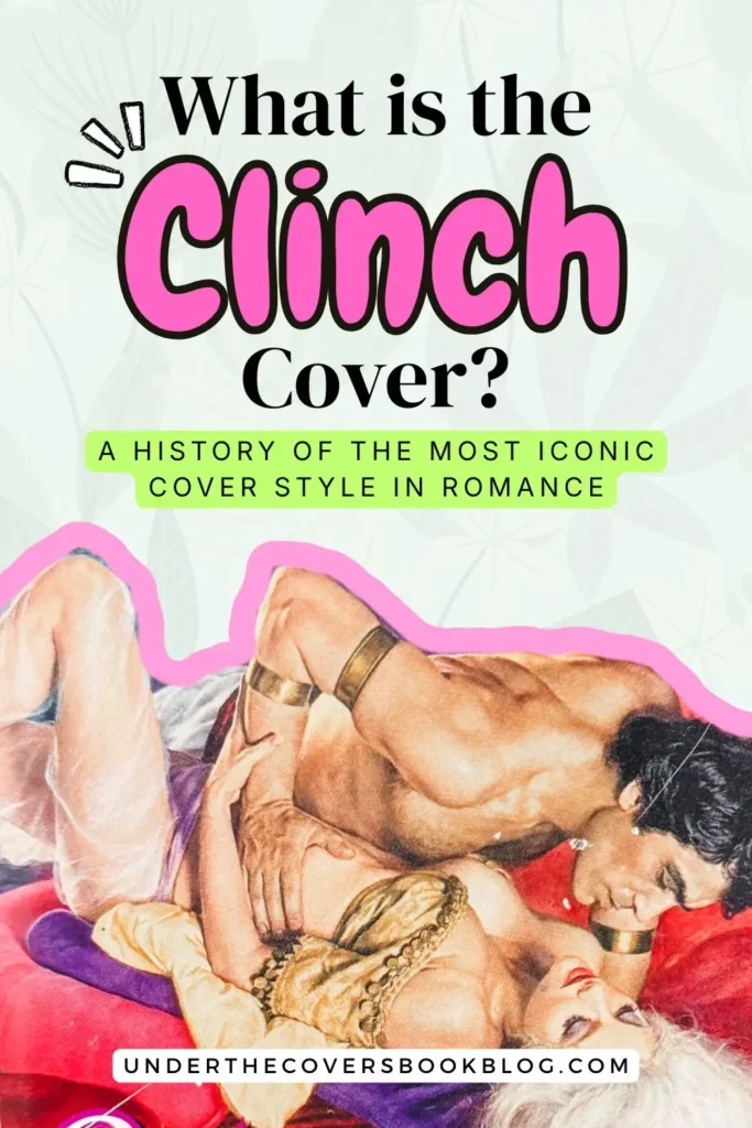
What Is a Clinch Cover? A History of Romance’s Most Iconic Cover Style
What is a clinch cover? Explore the history of clinch romance covers, from vintage historicals and Fabio to stepbacks, shame, and their modern comeback.
If you have spent any real time with vintage romance, you’ve definitely clocked the windswept hair, heaving bosoms, an impossible posture, the heroine bent backwards and the hero looking like self control left the building three chapters ago.
You may not have known there was a name for it though.
That iconic cover style, full of sexual tension with a couple in an embrace, is called the clinch. And once I started digging into the history of romance covers, I knew I had to spend some time with this foundational piece of romance history. Not only is it one of the most recognizable looks of romance, but it also opens the conversation about publishing, artistry, reader shame, cultural taste and the visibility of women’s desire.
So that’s what we’re doing here today. Deep diving into what is a clinch cover, where it came from, why it faded and why I think it’s making a comeback.
Prefer to watch instead?
This post contains affiliate links. That means we receive a small commission at no cost to you from any purchases you make through these links.
What is a clinch cover?
Let’s start at the beginning. The simple answer is this: a clinch cover is a romance novel cover that shows the central couple in a passionate embrace. Usually it also signals emotional intensity, sexual tension, fantasy, or even all three at the same time.
If you’ve spent any time around old school historicals, you’ve definitely seen a clinch or two.
In the mass market paperback era, covers had to do a lot of work very quickly to sell a book. The clinch could tell the reader what kind of fantasy they were getting from across the room, before they ever turned the book over and read the back cover copy. Heat, drama and longing in one small package.
What’s the origin of the clinch cover?
This is where my research got even more interesting. It all starts with the explosion of historical romance as we know it in the 1970s thanks to Avon and Kathleen E. Woodiwiss. Through the 1960s and 1970s, publishing responded to the changing cultural attitudes around sexuality from the women’s liberation movement. Also to the demand for more romance books, which was booming.
The books were getting steamier, the audience was getting bigger and the covers had to change.
Up to 1974 we can still see that publishing saw romance as something that needed to be demure. The Bantam art director said the covers were supposed to look like little white candy boxes. The packaging leaned sweet, even if you look at some of the biggest sellers of that time, like The Flame and the Flower and Sweet Savage Love. The inside now had explicit scenes, which was revolutionary, but the outside had still not caught up.
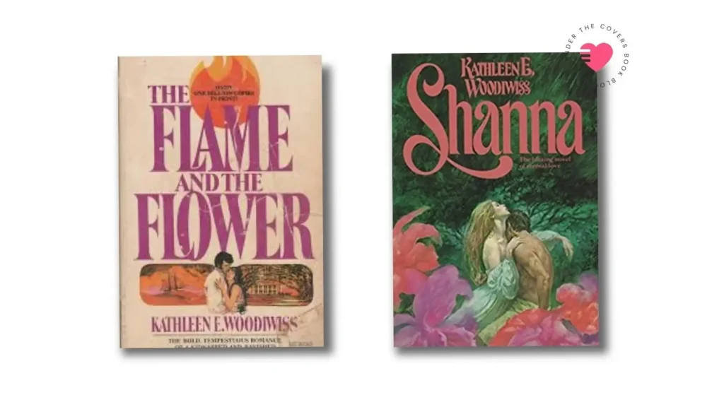
Now while Avon was leading the way, publishing the types of romances women wanted to read, they were also making moves to bring the clinch to the forefront. You can easily see that in Kathleen E. Woodiwiss alone if you look at the original cover of The Flame and the Flower (1974) and Shanna (1977). Most people credit Avon with kicking the door open for the introduction of the clinch cover.
But in my research I also found a fun little fact about the clinch cover that I love. In Publishing Romance, John Markert introduces Mary Ann Stuart, the editorial director of Playboy Press in 1975. Yes, that Playboy. She goes to her bosses with the idea that they should start publishing romance novels.
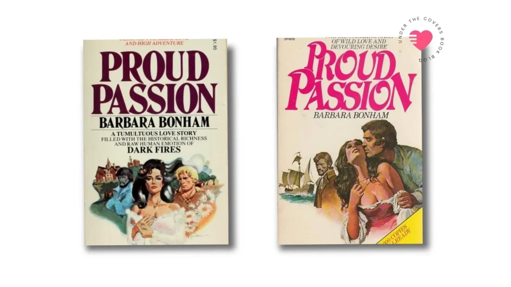
Their first release, Proud Passion by Barbara Bonham released in 1976 and sold half a million copies in the first six months. Playboy Press is now in the romance novel business. But they see that there’s a problem with the visuals. In order for women to know what kind of book they are getting, meaning this is not the tame white little candy box kind of book, people had to turn the book over and read the back cover copy. So they decide their visuals, meaning the cover, needed to be bolder and unmistakably relay that message.
They invest heavily in the cover art, hire illustrators and don’t shy away from being more explicit with the kinds of images they are putting on their covers. They know how to sell that. Something you can also see in the new cover of Proud Passion from just a few years after original release.
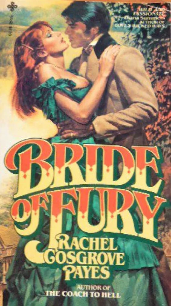
But it isn’t until Bride of Fury by Rachel Cosgrove Payes in 1979 that other publishers start to take notice of what they can also start doing. This cover, illustrated by Elaine Duillo, marked a turning point. While the books released by Playboy Press were not considered “good”, their packaging was definitely working.
The Playboy Press model was about churning out quantity over quality and by 1982 it was acquired by Berkley/Jove. By 1984 they stopped publishing. But their impact on the iconic covers of romance novels it’s still felt today and became a staple of recognition in the genre.
How is a clinch cover made?
Nowadays we are used to covers being either a photograph or a digital illustration. But in the 1970s and 1980s, the clinch was a much bigger production. First, there was a production team working on these photo shoots. Yes, they started as photographs. Costumes, setting design, props. The models, photographers, design team all then worked with an illustrator. An artist would come in, take the photo and paint that. Even though they may seem like photographs, these are actual oil paintings!
In the early days, the cover artist would also get a bound manuscript of the book and they would read through it and pick the exact scene they wanted to paint and go from there. Everything they included in their covers was a subliminal point. That level of care and artistry would later on be compared to Bernini paintings. Which just makes me think how unfortunate that over all these years, romance covers, in particular the clinch, have been mocked by everyone when they were pocket sized pieces of art.
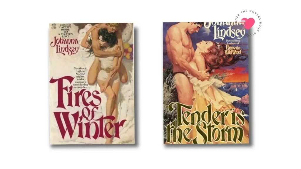
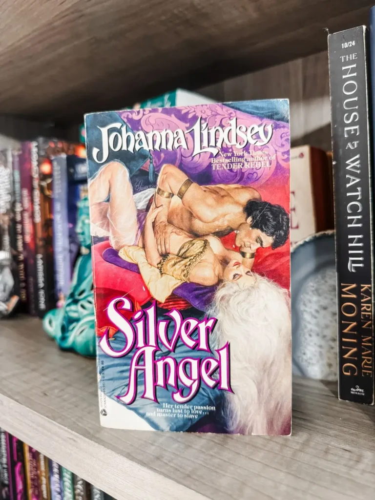
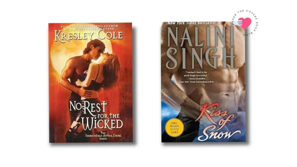
Illustrator Robert McGinnis gave us the first romance cover featuring a fully naked man. That was Fires of Winter by Johanna Lindsey in 1980. In 1985, he is also responsible for the one of the most iconic clinch covers of all time, Tender is the Storm. This cover was so controversial bookstores couldn’t sell it as is. It originally featured a naked man turned to the side. A sticker was used to cover the specific areas of the cover in order to put it on the shelves. And there are also multiple versions of this cover, some with more foliage to cover the man, and some with adding underwear to his naked body.
As the years go on, the artists get a bit less say on what the shoots look like and have to rely on what the design team wants painted. And then comes the era of the identifiable cover model that would define a generation (and a genre). Fabio.
Who even is Fabio?
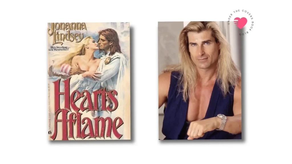
Fabio Lanzoni was born in Milan in 1959 and came to America at the age of 19 looking for a modeling career. He walks into Ford Modeling Agency and 15 minutes later walks out with a contract. He starts working and has no idea what a lot of the photo shoots he was going on were even used for. Until 3 women at a night club in Miami tell him he looks just like the cover of their romance novels. He doesn’t believe it, but they show him the book. And that was the first time he saw himself on a book cover. The rest is history.
After the success of Hearts Aflame, and thanks to Elaine Duillo for having the vision to put him on the cover, sales are pouring in and all the publishers want Fabio on the cover. At one point he was doing 15 photo shoots per day. His face became synonymous with the romance novel, and the clinch. But also with the mockery of the genre.
And while Fabio became one of the most iconic and recognizable faces of romance publishing, not everyone had the same access to visibility and representation.
The clinch and the politics of visibility
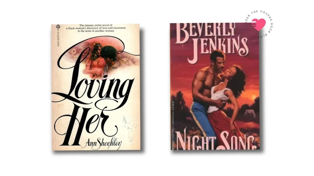
Everything in the romance genre, not just the clinch, was very white and heteronormative. While we can point to a few moments of radical visibility during the 1970s and beyond, these were certainly not common and not the norm. That includes books like Avon’s Loving Her by Ann Allen Shockley (1974), often referred to as the first Black lesbian romance, and Beverly Jenkins’s debut novel, Night Song (1994), which featured a clinch cover with a Black couple.
In a sea of romance novels and clinch covers, it was very hard to find representation besides white and heterosexual. And it bears making note that while we have made progress, it is nowhere near where we need to be. The Ripped Bodice, a romance only bookstore, has been sharing a report of diversity in romance books since 2016. Some strides were made after 2020 but we have since declined again. This is an ongoing issue that we can all contribute to change by supporting diverse authors writing about diverse characters. Buying their books.
Would you like to save this?
The romance industry kept adapting to the cultural moments it moved through. It didn’t exist in isolation. And as the genre’s openness around women’s sexuality became harder to display publicly, the covers started to reflect that too.
Stepbacks, Shame and the Art of Hiding the Clinch
While the 80s were a time of liberation and bold covers, the louder they became, the more they were dismissed. And over time, we saw the publishing industry respond to that shame. The clinch starts getting replaced with large typography of the authors name or book title with maybe a flower or a small object, even a landscape or a building. The romance is no longer on the cover.
I would argue that what comes next is a direct response of feeling like you had to hide the sensuality of the clinch. The stepback. The stepback is an interior page after the cover that features the full clinch or art but it’s hidden by the more respectable cover. The one you can show in public without feeling like you’re being judged for reading a “dirty book”.
And listen, I love a stepback. There’s something so beautiful about it, a little hidden gem that gives you exactly the vibes you’ll get in that book. But I’ve been thinking lately about why that had to be taken off the cover. Maybe it’s because I’ve been thinking myself about my own personal history with feeling that shame for reading those books in public.
Nevertheless, the stepback gave readers the built in way to not have to deal with that. In some books, it was done away with completely, no stepback needed.
Through the 90s this was prevalent and society kept telling romance readers that the books they loved were something frivolous, low brow, dirty. There was no literary value in them and no art or merit in the beauty of those covers. The constant ridicule definitely did a number on a whole generation or two. I certainly bought into those ideas myself.
If you want to read more about my experiences with overcoming those preconceived ideas and shame around romance novels and romance covers, check out my essay on why I used to hide my books. Definitely come and share your own thoughts about that too.
From Flowers to Torsos to Objects
Next in the evolution of covers was the period of the 2000s and 2010s. A very interesting period with lots of changes in the romance genre. I was there for quite a bit of that as I was fully deep in my romance reader era at the time and even this blog was started in 2011.
Those demure flowers and buildings got sexed up and replaced with actual photography. Couples and single characters alike. And we swing back to the mentality that sex sells. But instead of the clinch we bring the headless, shirtless, man chest. So many of these covers were men with six pack abs, maybe a little sweaty, and usually without a head. Why, you may ask? Authors always told me it was because they wanted the look of the character to be left to the imagination of the reader. If you add a face, now they have to imagine that while reading. Fair. Not everything was faceless though, and we had our own Fabio of this time if I do say so myself. But we will talk about Paul Marron another time.
I do find it interesting that the clinch was a bit too much and needed to be covered, but then we replace it with a sexualized body part. As much as I did enjoy (and still do) the abs covers (I’m a product of my generation, y’all), I can’t help but notice now looking back that we removed the romance from the cover. A man chest does not deliver the same tension, yearning and plot than a clinch used to.
And this went on for many years until the phenomenon that was Fifty Shades of Grey. Fifty Shades brought romance to the mainstream in a big way. Erotic romance at that. So many new readers discovered the romance genre through it, and I remember the phrase “not your mother’s romance” used a lot. I feel like the point was always to distance from the bodice rippers and the clinch covers.
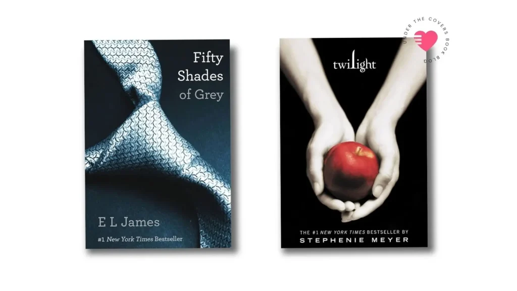
From a cover perspective, Fifty Shades did that in a big way. It introduced and popularized the random object cover. Very minimalist in style, obviously because it was originally Twilight fan fiction so it followed the format of the Twilight cover. But this became the standard for romance covers, especially erotic romance covers. You could take out an erotic romance, super steamy, and read it at the park without anyone knowing that’s what you were reading. And that alone gave a lot of women freedom to enjoy romance again.
I think this goes back to the shame part, but it’s also a time where women were fighting that stigma and stereotype in a big way. So while yes, the object covers were popular and everywhere, not everyone was happy with the notion that we needed that in order to enjoy reading romance.
Why illustrated covers took over?
By the mid 2010s, a lot of those feelings were bubbling up in the surface and another seismic shift would come in the way of illustrated covers. This wasn’t anything new, chic lit had done cute illustrated covers with pastel colors way before. But bringing that to the romance genre was, in a way, revolutionary. Again, there was a wave of new readers that felt like they could pick up a romance. They had preconceived ideas before about their possible dislike for the genre and they would never be caught with a cover that would represent that visually.
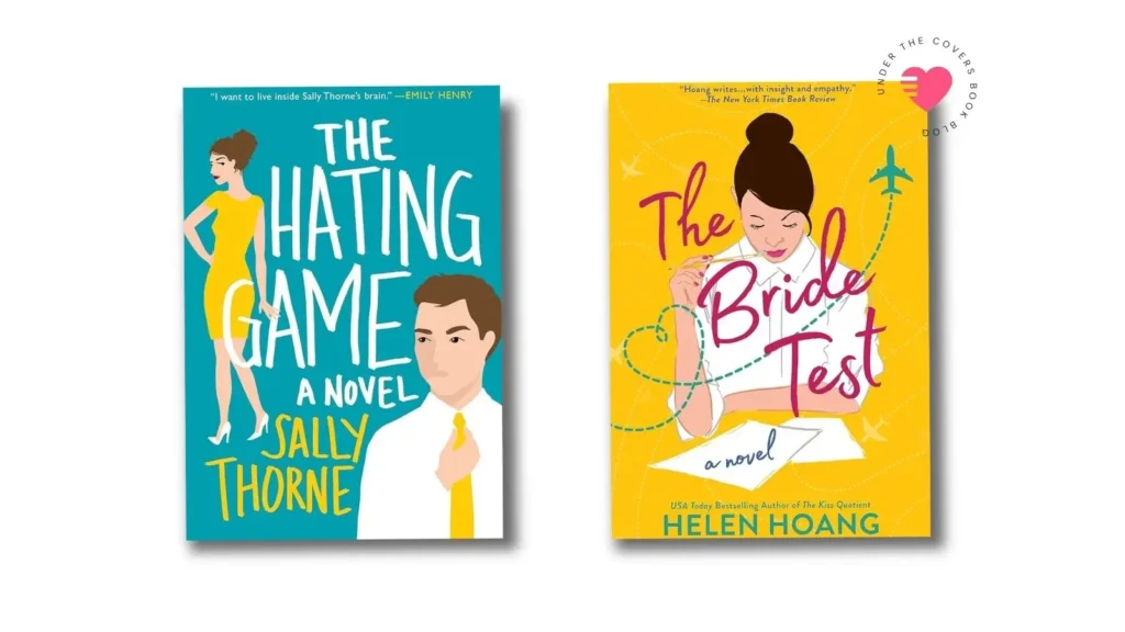
But the illustrated cover gave them room to mask romance with women’s fiction or chic lit, and that opened the door for yet another wave of new readers coming into the romance genre. The books and storylines also, often, reflected that change. One of the big standouts of the time was The Hating Game by Sally Thorne.
This moment in time also coincided with the rise of Bookstagram and people wanting to take pictures of books to post online. I had a chat with Erin from Penguin Random House where we discussed the rise of the book as object and how that influenced covers, especially the illustrated romcom boom. People were actually buying books not just to read them, but also to display them and photograph them.
Bringing it back to the clinch though, while these illustrated covers were often more romantic than a sexy headless torso, even if less sexual, there was hardly a clinch pose in sight. And it stayed that way for the better part of the decade.
Is the clinch cover making a comeback?
I’ve been feeling for a while that romance has been shifting since yet another generation of readers has picked up the baton of romance. But the Booktok generation didn’t grow up with the shame that a lot of us did around the books we enjoy to read. They’ve been asking for more yearning, more romance, big and bold storylines. And yes that has been reflected in the covers.
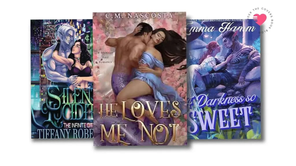
One of the leading sub-genres in this in my opinion was indie monster romance. They’ve been quietly bringing the clinch back for the past few years. Authors now routinely use illustrators to design their covers, which is the modern version of the clinch artists. And for monster romance this was needed from the start. It’s not that easy to find a big blue horned alien on stock photo sites to be manipulated in Photoshop to produce a good cover.
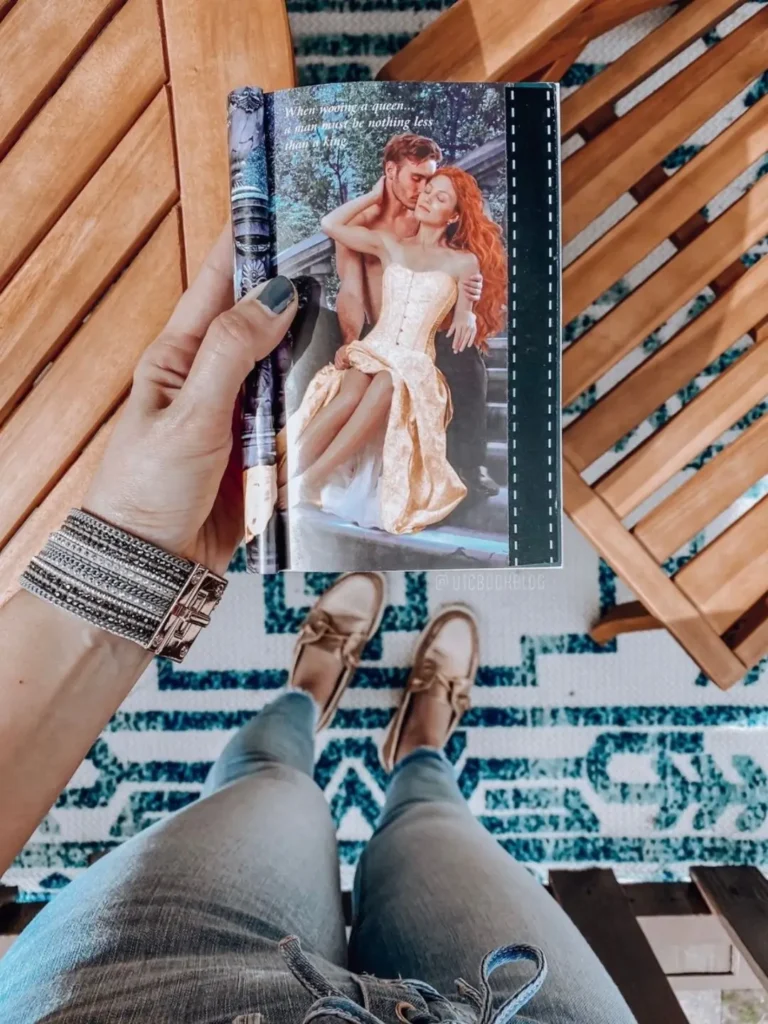
But with monsters leading the way, it still took a few years for the general contemporary illustrated covers to catch up. We would still find the flat looking illustrations that didn’t really deliver on the detail of what the book was supposed to give us in terms of the romance or the story. But the year is now 2026 and I can’t help but notice that the illustrators doing contemporary romance covers are now doing the same job the artists of the 80s were doing. Setting the scene and showing the romance. And yes, often bringing back a clinch pose.
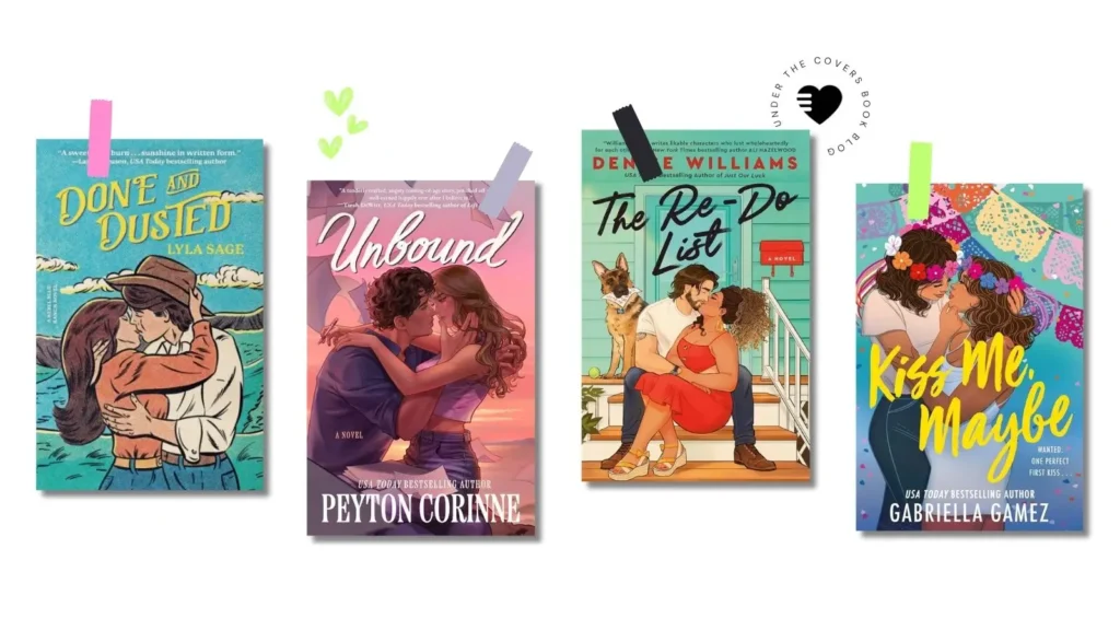
Romance is front and center again, in all sorts of styles. I love this modern take of the clinch. Whether it’s in a vintage comic book style like Done & Dusted by Lyla Sage, manga style like Unbound by Peyton Corinne or just adding more detail to the illustration style we are already used to. But more importantly, we are finally able to include the exact representation we want to see in the books. We see this in covers like The Re-Do List by Denise Williams featuring an interracial couple and Kiss Me, Maybe by Gabriella Gamez showing a queer couple. Diversity in covers was never an easy thing in the times of photography, especially for indie authors that relied on stock photos.
Final Thoughts
I think the essence of what the clinch cover gave romance readers, and the genre as a whole, is the ability to see through the pages into the story you’re about to read. While other covers have often functioned as packaging, whether for sales or for hiding, the clinch feels like the most honest representation of what a romance novel is all about. And I’m happy that we’re getting to a place where we can celebrate those things openly instead of wanting or needing to hide them or mock them.
But what are your thoughts on clinch covers, and what is your relationship with them? Do you love them? Hate them? Used to hide them? Or flaunt them? And do you agree with my theory that we’re seeing the modern return of the clinch? Let me know in the comments.
Keep exploring romance novel history with a deep dive on why the 1980s romance novels had the most problematic alpha heroes.
Pin It for Later
What a wonderful read on the clinch! I absolutely agree with everything you’ve discussed. lol you, I grew up devouring historical romance from the late 80’s on. My very first read was Johanna Lindsey’s Hearts Aflame. I have all of her books most with the classic clinch and Fabio. You’re right, I was a bit embarrassed to read them when I was in my late teens and twenties because I didn’t want people to think I read ‘sexy’ books. I’m an aspiring historical romance writer myself and would adore a take on the classic clinch for my covers. It showcases the emotion/passion/love of the story and gives a taste of the era and what it’s about. Like everything, it’s a result of that particular decade and the socials norms of the time.
Personally, the illustrated updated versions of the clinch that are around now will never be as ‘steamy’ but do attract the new generation of readers. And there’s nothing wrong with Fabio! 😊
I agree that the new covers aren’t as steamy as the old ones, but we are at least getting closer to the emotion and love in the story reflected on the cover. 🙂 And I think it would be great if you have a clinch take on your book! So happy you enjoyed the read.